Our rules have been updated and given their own forum. Go and look at them! They are nice, and there may be new ones that you didn't know about! Hooray for rules! Hooray for The System! Hooray for Conforming!
Our new Indie Games subforum is now open for business in G&T. Go and check it out, you might land a code for a free game. If you're developing an indie game and want to post about it, follow these directions. If you don't, he'll break your legs! Hahaha! Seriously though.
Thedandmom 2014
thedandmom Registered User regular
Registered User regular
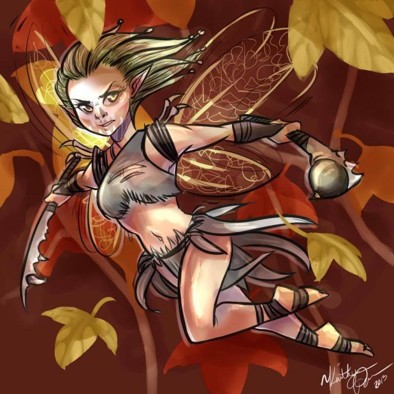
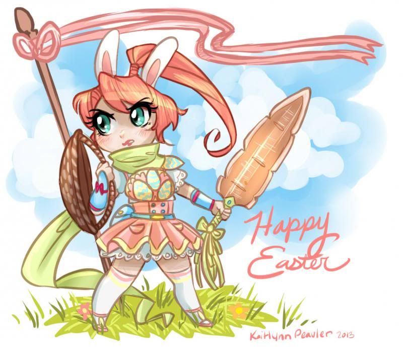
Posting some of my works so far from this year. Will also put more posts of artwork from this year in this thread.
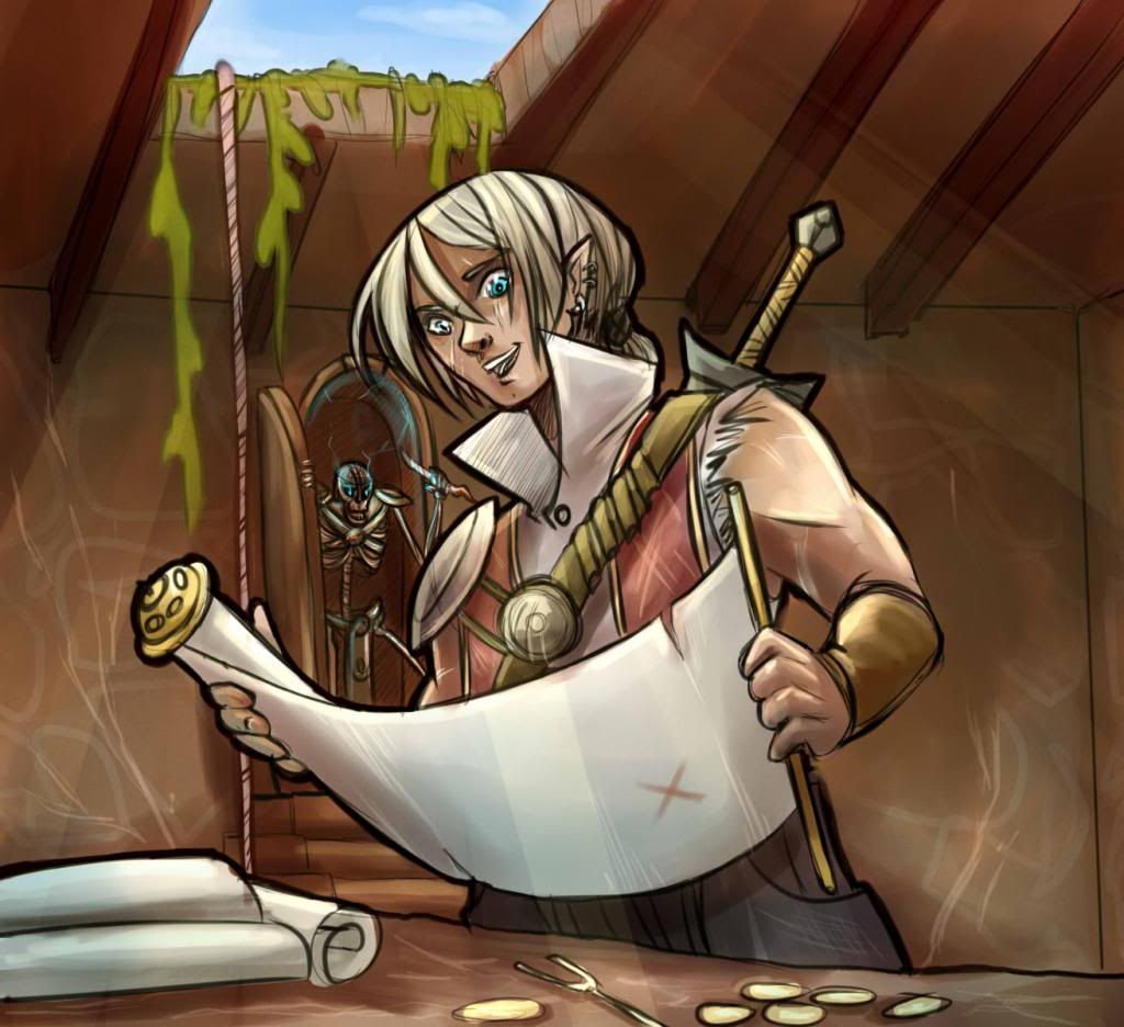
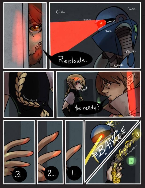 Latest page of my webcomic (which you can check out by clicking the picture)
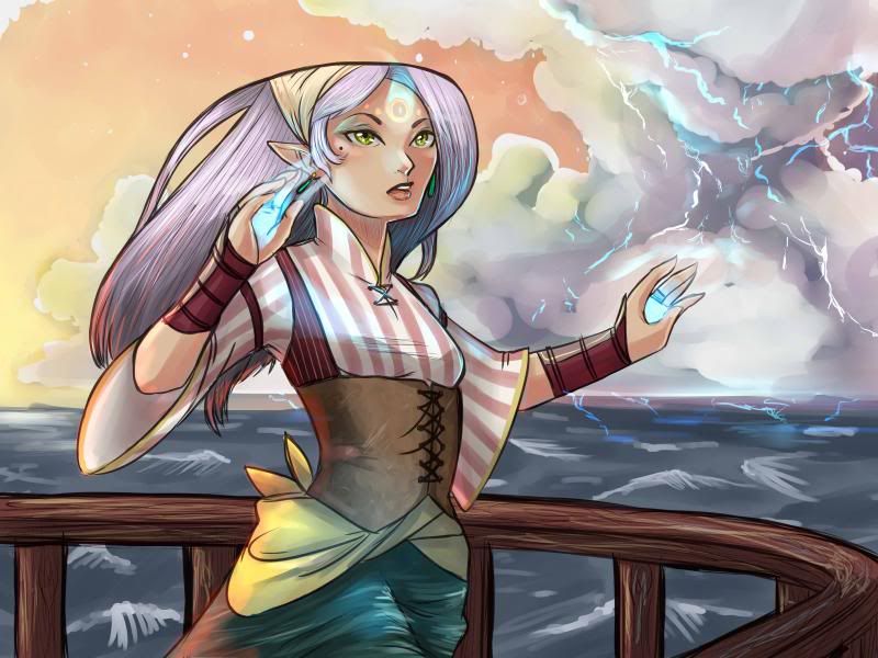
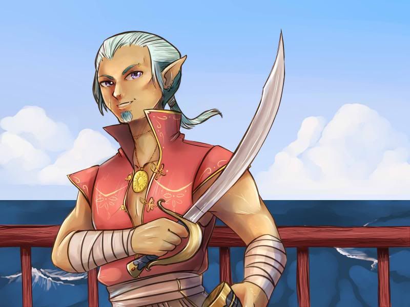
All the piraty looking images are for a game that I'm doing the artwork for called Conquering Corsairs.
Latest page of my webcomic (which you can check out by clicking the picture)All the piraty looking images are for a game that I'm doing the artwork for called Conquering Corsairs.
thedandmom on
0
Posts
A couple more images from the game i'm working on. Also as a note. All this pirate stuff will be under CC come this summer for reuse.
Panel 1: Guy is looking through a crack in a door.
Panel 2: POV of what guy is looking at.
Panel 3: Girl spins around?
Then it looks like they shoot the robot in the head. But whose hand is that? And who is holding that gun? Did they kick the door open and surprise the robot? Some establishing shots would help.
Your sound effects could use some work. They look handwritten, which is fine, but they offer no contrast against your dialogue. They also don't enhance the sound they are imitating. I would expect "Click" and "Bzz" to look very different against each other. Right now, the sound effects look like an afterthought.
Not sure why your word balloons are black with white text. Usually that's reserved for a character that might have a dark or spooky voice.
Watch the order of your word balloons. It's not too bad on this page, although "nod" comes before "Your ready?". Remember that people read left to right and top to bottom. The order of your panels and your balloons should reflect this.
Do you have NON anime stuff we could see? Im sure you've heard it before, but learning real anatomy will make your anime stuff even stronger.
1) As a small side note, one day, I really hope to be King Penis of Fuck Mountain.
2) No shitty anime or wolf-people, take that crap to deviant art
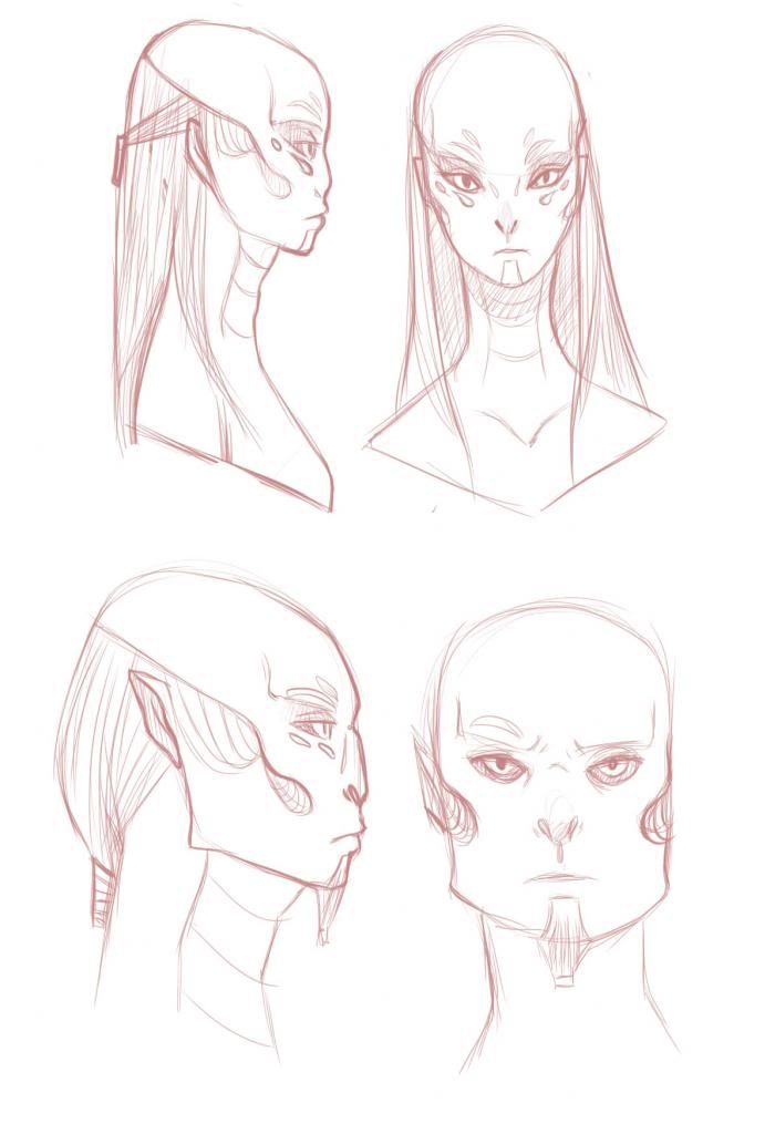
The top of the head lines up, but the rest of the features do not. The eyes mouth nose are all lower on the right model, where on the left everything is elevated. A simple way to avoid this when doing different angles is to establish guidelines on the paper where certain features are supposed to line up. @iruka has a good example of this, I just can't seem to find it.
This is a warning that my sig was too tall.
You could have sent me a PM or something.
— Robert Heinlein
1) As a small side note, one day, I really hope to be King Penis of Fuck Mountain.
2) No shitty anime or wolf-people, take that crap to deviant art